mirror of
https://github.com/netbox-community/netbox.git
synced 2026-01-11 21:10:29 +01:00
New dashboard widgets have insufficient header contrast in dark mode #7889
Closed
opened 2025-12-29 20:29:35 +01:00 by adam
·
7 comments
No Branch/Tag Specified
main
update-changelog-comments-docs
feature-removal-issue-type
20911-dropdown
20239-plugin-menu-classes-mutable-state
21097-graphql-id-lookups
feature
fix_module_substitution
20923-dcim-templates
20044-elevation-stuck-lightmode
feature-ip-prefix-link
v4.5-beta1-release
20068-import-moduletype-attrs
20766-fix-german-translation-code-literals
20378-del-script
7604-filter-modifiers-v3
circuit-swap
12318-case-insensitive-uniqueness
20637-improve-device-q-filter
20660-script-load
19724-graphql
20614-update-ruff
14884-script
02496-max-page
19720-macaddress-interface-generic-relation
19408-circuit-terminations-export-templates
20203-openapi-check
fix-19669-api-image-download
7604-filter-modifiers
19275-fixes-interface-bulk-edit
fix-17794-get_field_value_return_list
11507-show-aggregate-and-rir-on-api
9583-add_column_specific_search_field_to_tables
v4.5.0
v4.4.10
v4.4.9
v4.5.0-beta1
v4.4.8
v4.4.7
v4.4.6
v4.4.5
v4.4.4
v4.4.3
v4.4.2
v4.4.1
v4.4.0
v4.3.7
v4.4.0-beta1
v4.3.6
v4.3.5
v4.3.4
v4.3.3
v4.3.2
v4.3.1
v4.3.0
v4.2.9
v4.3.0-beta2
v4.2.8
v4.3.0-beta1
v4.2.7
v4.2.6
v4.2.5
v4.2.4
v4.2.3
v4.2.2
v4.2.1
v4.2.0
v4.1.11
v4.1.10
v4.1.9
v4.1.8
v4.2-beta1
v4.1.7
v4.1.6
v4.1.5
v4.1.4
v4.1.3
v4.1.2
v4.1.1
v4.1.0
v4.0.11
v4.0.10
v4.0.9
v4.1-beta1
v4.0.8
v4.0.7
v4.0.6
v4.0.5
v4.0.3
v4.0.2
v4.0.1
v4.0.0
v3.7.8
v3.7.7
v4.0-beta2
v3.7.6
v3.7.5
v4.0-beta1
v3.7.4
v3.7.3
v3.7.2
v3.7.1
v3.7.0
v3.6.9
v3.6.8
v3.6.7
v3.7-beta1
v3.6.6
v3.6.5
v3.6.4
v3.6.3
v3.6.2
v3.6.1
v3.6.0
v3.5.9
v3.6-beta2
v3.5.8
v3.6-beta1
v3.5.7
v3.5.6
v3.5.5
v3.5.4
v3.5.3
v3.5.2
v3.5.1
v3.5.0
v3.4.10
v3.4.9
v3.5-beta2
v3.4.8
v3.5-beta1
v3.4.7
v3.4.6
v3.4.5
v3.4.4
v3.4.3
v3.4.2
v3.4.1
v3.4.0
v3.3.10
v3.3.9
v3.4-beta1
v3.3.8
v3.3.7
v3.3.6
v3.3.5
v3.3.4
v3.3.3
v3.3.2
v3.3.1
v3.3.0
v3.2.9
v3.2.8
v3.3-beta2
v3.2.7
v3.3-beta1
v3.2.6
v3.2.5
v3.2.4
v3.2.3
v3.2.2
v3.2.1
v3.2.0
v3.1.11
v3.1.10
v3.2-beta2
v3.1.9
v3.2-beta1
v3.1.8
v3.1.7
v3.1.6
v3.1.5
v3.1.4
v3.1.3
v3.1.2
v3.1.1
v3.1.0
v3.0.12
v3.0.11
v3.0.10
v3.1-beta1
v3.0.9
v3.0.8
v3.0.7
v3.0.6
v3.0.5
v3.0.4
v3.0.3
v3.0.2
v3.0.1
v3.0.0
v2.11.12
v3.0-beta2
v2.11.11
v2.11.10
v3.0-beta1
v2.11.9
v2.11.8
v2.11.7
v2.11.6
v2.11.5
v2.11.4
v2.11.3
v2.11.2
v2.11.1
v2.11.0
v2.10.10
v2.10.9
v2.11-beta1
v2.10.8
v2.10.7
v2.10.6
v2.10.5
v2.10.4
v2.10.3
v2.10.2
v2.10.1
v2.10.0
v2.9.11
v2.10-beta2
v2.9.10
v2.10-beta1
v2.9.9
v2.9.8
v2.9.7
v2.9.6
v2.9.5
v2.9.4
v2.9.3
v2.9.2
v2.9.1
v2.9.0
v2.9-beta2
v2.8.9
v2.9-beta1
v2.8.8
v2.8.7
v2.8.6
v2.8.5
v2.8.4
v2.8.3
v2.8.2
v2.8.1
v2.8.0
v2.7.12
v2.7.11
v2.7.10
v2.7.9
v2.7.8
v2.7.7
v2.7.6
v2.7.5
v2.7.4
v2.7.3
v2.7.2
v2.7.1
v2.7.0
v2.6.12
v2.6.11
v2.6.10
v2.6.9
v2.7-beta1
Solcon-2020-01-06
v2.6.8
v2.6.7
v2.6.6
v2.6.5
v2.6.4
v2.6.3
v2.6.2
v2.6.1
v2.6.0
v2.5.13
v2.5.12
v2.6-beta1
v2.5.11
v2.5.10
v2.5.9
v2.5.8
v2.5.7
v2.5.6
v2.5.5
v2.5.4
v2.5.3
v2.5.2
v2.5.1
v2.5.0
v2.4.9
v2.5-beta2
v2.4.8
v2.5-beta1
v2.4.7
v2.4.6
v2.4.5
v2.4.4
v2.4.3
v2.4.2
v2.4.1
v2.4.0
v2.3.7
v2.4-beta1
v2.3.6
v2.3.5
v2.3.4
v2.3.3
v2.3.2
v2.3.1
v2.3.0
v2.2.10
v2.3-beta2
v2.2.9
v2.3-beta1
v2.2.8
v2.2.7
v2.2.6
v2.2.5
v2.2.4
v2.2.3
v2.2.2
v2.2.1
v2.2.0
v2.1.6
v2.2-beta2
v2.1.5
v2.2-beta1
v2.1.4
v2.1.3
v2.1.2
v2.1.1
v2.1.0
v2.0.10
v2.1-beta1
v2.0.9
v2.0.8
v2.0.7
v2.0.6
v2.0.5
v2.0.4
v2.0.3
v2.0.2
v2.0.1
v2.0.0
v2.0-beta3
v1.9.6
v1.9.5
v2.0-beta2
v1.9.4-r1
v1.9.3
v2.0-beta1
v1.9.2
v1.9.1
v1.9.0-r1
v1.8.4
v1.8.3
v1.8.2
v1.8.1
v1.8.0
v1.7.3
v1.7.2-r1
v1.7.1
v1.7.0
v1.6.3
v1.6.2-r1
v1.6.1-r1
1.6.1
v1.6.0
v1.5.2
v1.5.1
v1.5.0
v1.4.2
v1.4.1
v1.4.0
v1.3.2
v1.3.1
v1.3.0
v1.2.2
v1.2.1
v1.2.0
v1.1.0
v1.0.7-r1
v1.0.7
v1.0.6
v1.0.5
v1.0.4
v1.0.3-r1
v1.0.3
1.0.0
Labels
Clear labels
beta
breaking change
complexity: high
complexity: low
complexity: medium
needs milestone
netbox
pending closure
plugin candidate
pull-request
severity: high
severity: low
severity: medium
status: accepted
status: backlog
status: blocked
status: duplicate
status: needs owner
status: needs triage
status: revisions needed
status: under review
topic: GraphQL
topic: Internationalization
topic: OpenAPI
topic: UI/UX
topic: cabling
topic: event rules
topic: htmx navigation
topic: industrialization
topic: migrations
topic: plugins
topic: scripts
topic: templating
topic: testing
type: bug
type: deprecation
type: documentation
type: feature
type: housekeeping
type: translation
Mirrored from GitHub Pull Request
Milestone
No items
No Milestone
Projects
Clear projects
No project
Notifications
Due Date
No due date set.
Dependencies
No dependencies set.
Reference: starred/netbox#7889
Reference in New Issue
Block a user
Blocking a user prevents them from interacting with repositories, such as opening or commenting on pull requests or issues. Learn more about blocking a user.
Delete Branch "%!s()"
Deleting a branch is permanent. Although the deleted branch may continue to exist for a short time before it actually gets removed, it CANNOT be undone in most cases. Continue?
Originally created by @sleepinggenius2 on GitHub (Apr 11, 2023).
Originally assigned to: @jeremystretch on GitHub.
NetBox version
v3.5.0-dev
Python version
3.8
Steps to Reproduce
Expected Behavior
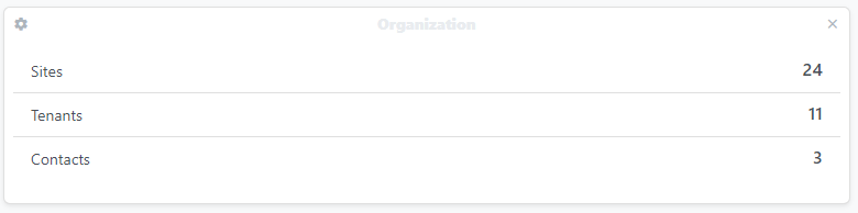
The text and icon colors within the card header should maintain at least the same contrast ratio between light and dark modes. You can see this done within the search and log in buttons in the screenshots below.
Observed Behavior
Currently, the colors used for the text and icons for card headers in dark mode do not provide much contrast against the background, making them very difficult to see. Screenshots below for reference.
@mmfreitas commented on GitHub (Apr 11, 2023):
For the lighter colors this happens:

Could this be fixed the same way the #8088 was?
@jeremystretch commented on GitHub (Apr 11, 2023):
I don't think we'll be able to use
foreground_color()directly, because it takes a discrete RGB value, whereas in this case we're working with named colors (e.g.bluevs.#0000ff). But we should be able to come up with a similar approach.@sleepinggenius2 commented on GitHub (Apr 12, 2023):
Just playing around with this a bit in Dev Tools, I changed the
text-lightclass totext-blackfor the text andtext-graytotext-black-50for the icons and it certainly puts the contrast for the text at a good level. At 50% opacity though, the icons are still a little low on contrast, but at 100%, I think they have too much contrast (example on NetBox News widget). Those were the only out-of-the-box Bootstrap color classes that I saw available to try in the black space, but I haven't had a chance to look into the code to see if changing the classes like that between themes is even a viable option. Screenshot for reference:@jsenecal commented on GitHub (Apr 27, 2023):
Actually, just removing the class

bg-secondaryon thecard-headerdiv makes this much more readable and looks a bit more like the original ui:The lighter version still needs it or at least the text and icons need a different class:
Same with

text-darkapplied:If the proposed solution is accepted I can take ownership of this.
@jeremystretch commented on GitHub (Apr 27, 2023):
I much prefer keeping the card headers. IMO it looks better and the ability to select different colors helps provide visual clues.
@jsenecal commented on GitHub (Apr 27, 2023):
It wouldn't change the ability to change colors, only change the default gray looking one @jeremystretch .
@heroin-moose commented on GitHub (Sep 5, 2023):
This is really an issue, because even for the demo site we have either: