mirror of
https://github.com/netbox-community/netbox.git
synced 2026-03-02 12:30:06 +01:00
Decrease amount of padding in data tables from the current 64% of vertical space #7878
Closed
opened 2025-12-29 20:29:20 +01:00 by adam
·
21 comments
No Branch/Tag Specified
main
21524-invlaid-paths-exception
21518-cf-decimal-zero
21356-etags
feature
20787-spectacular
21477-extend-graphql-api-filters-for-cables
21331-deprecate-querystring-tag
21304-deprecate-housekeeping-command
21429-cable-create-add-another-does-not-carry-over-termination
21364-swagger
20442-callable-audit
feature-ip-prefix-link
20923-dcim-templates
20911-dropdown-3
fix_module_substitution
21203-q-attr-denorm
21160-filterset
21118-site
20911-dropdown-2
21102-fix-graphiql-explorer
20044-elevation-stuck-lightmode
v4.5-beta1-release
20068-import-moduletype-attrs
20766-fix-german-translation-code-literals
20378-del-script
7604-filter-modifiers-v3
circuit-swap
12318-case-insensitive-uniqueness
20637-improve-device-q-filter
20660-script-load
19724-graphql
20614-update-ruff
14884-script
02496-max-page
19720-macaddress-interface-generic-relation
19408-circuit-terminations-export-templates
20203-openapi-check
fix-19669-api-image-download
7604-filter-modifiers
19275-fixes-interface-bulk-edit
fix-17794-get_field_value_return_list
11507-show-aggregate-and-rir-on-api
9583-add_column_specific_search_field_to_tables
v4.5.3
v4.5.2
v4.5.1
v4.5.0
v4.4.10
v4.4.9
v4.5.0-beta1
v4.4.8
v4.4.7
v4.4.6
v4.4.5
v4.4.4
v4.4.3
v4.4.2
v4.4.1
v4.4.0
v4.3.7
v4.4.0-beta1
v4.3.6
v4.3.5
v4.3.4
v4.3.3
v4.3.2
v4.3.1
v4.3.0
v4.2.9
v4.3.0-beta2
v4.2.8
v4.3.0-beta1
v4.2.7
v4.2.6
v4.2.5
v4.2.4
v4.2.3
v4.2.2
v4.2.1
v4.2.0
v4.1.11
v4.1.10
v4.1.9
v4.1.8
v4.2-beta1
v4.1.7
v4.1.6
v4.1.5
v4.1.4
v4.1.3
v4.1.2
v4.1.1
v4.1.0
v4.0.11
v4.0.10
v4.0.9
v4.1-beta1
v4.0.8
v4.0.7
v4.0.6
v4.0.5
v4.0.3
v4.0.2
v4.0.1
v4.0.0
v3.7.8
v3.7.7
v4.0-beta2
v3.7.6
v3.7.5
v4.0-beta1
v3.7.4
v3.7.3
v3.7.2
v3.7.1
v3.7.0
v3.6.9
v3.6.8
v3.6.7
v3.7-beta1
v3.6.6
v3.6.5
v3.6.4
v3.6.3
v3.6.2
v3.6.1
v3.6.0
v3.5.9
v3.6-beta2
v3.5.8
v3.6-beta1
v3.5.7
v3.5.6
v3.5.5
v3.5.4
v3.5.3
v3.5.2
v3.5.1
v3.5.0
v3.4.10
v3.4.9
v3.5-beta2
v3.4.8
v3.5-beta1
v3.4.7
v3.4.6
v3.4.5
v3.4.4
v3.4.3
v3.4.2
v3.4.1
v3.4.0
v3.3.10
v3.3.9
v3.4-beta1
v3.3.8
v3.3.7
v3.3.6
v3.3.5
v3.3.4
v3.3.3
v3.3.2
v3.3.1
v3.3.0
v3.2.9
v3.2.8
v3.3-beta2
v3.2.7
v3.3-beta1
v3.2.6
v3.2.5
v3.2.4
v3.2.3
v3.2.2
v3.2.1
v3.2.0
v3.1.11
v3.1.10
v3.2-beta2
v3.1.9
v3.2-beta1
v3.1.8
v3.1.7
v3.1.6
v3.1.5
v3.1.4
v3.1.3
v3.1.2
v3.1.1
v3.1.0
v3.0.12
v3.0.11
v3.0.10
v3.1-beta1
v3.0.9
v3.0.8
v3.0.7
v3.0.6
v3.0.5
v3.0.4
v3.0.3
v3.0.2
v3.0.1
v3.0.0
v2.11.12
v3.0-beta2
v2.11.11
v2.11.10
v3.0-beta1
v2.11.9
v2.11.8
v2.11.7
v2.11.6
v2.11.5
v2.11.4
v2.11.3
v2.11.2
v2.11.1
v2.11.0
v2.10.10
v2.10.9
v2.11-beta1
v2.10.8
v2.10.7
v2.10.6
v2.10.5
v2.10.4
v2.10.3
v2.10.2
v2.10.1
v2.10.0
v2.9.11
v2.10-beta2
v2.9.10
v2.10-beta1
v2.9.9
v2.9.8
v2.9.7
v2.9.6
v2.9.5
v2.9.4
v2.9.3
v2.9.2
v2.9.1
v2.9.0
v2.9-beta2
v2.8.9
v2.9-beta1
v2.8.8
v2.8.7
v2.8.6
v2.8.5
v2.8.4
v2.8.3
v2.8.2
v2.8.1
v2.8.0
v2.7.12
v2.7.11
v2.7.10
v2.7.9
v2.7.8
v2.7.7
v2.7.6
v2.7.5
v2.7.4
v2.7.3
v2.7.2
v2.7.1
v2.7.0
v2.6.12
v2.6.11
v2.6.10
v2.6.9
v2.7-beta1
Solcon-2020-01-06
v2.6.8
v2.6.7
v2.6.6
v2.6.5
v2.6.4
v2.6.3
v2.6.2
v2.6.1
v2.6.0
v2.5.13
v2.5.12
v2.6-beta1
v2.5.11
v2.5.10
v2.5.9
v2.5.8
v2.5.7
v2.5.6
v2.5.5
v2.5.4
v2.5.3
v2.5.2
v2.5.1
v2.5.0
v2.4.9
v2.5-beta2
v2.4.8
v2.5-beta1
v2.4.7
v2.4.6
v2.4.5
v2.4.4
v2.4.3
v2.4.2
v2.4.1
v2.4.0
v2.3.7
v2.4-beta1
v2.3.6
v2.3.5
v2.3.4
v2.3.3
v2.3.2
v2.3.1
v2.3.0
v2.2.10
v2.3-beta2
v2.2.9
v2.3-beta1
v2.2.8
v2.2.7
v2.2.6
v2.2.5
v2.2.4
v2.2.3
v2.2.2
v2.2.1
v2.2.0
v2.1.6
v2.2-beta2
v2.1.5
v2.2-beta1
v2.1.4
v2.1.3
v2.1.2
v2.1.1
v2.1.0
v2.0.10
v2.1-beta1
v2.0.9
v2.0.8
v2.0.7
v2.0.6
v2.0.5
v2.0.4
v2.0.3
v2.0.2
v2.0.1
v2.0.0
v2.0-beta3
v1.9.6
v1.9.5
v2.0-beta2
v1.9.4-r1
v1.9.3
v2.0-beta1
v1.9.2
v1.9.1
v1.9.0-r1
v1.8.4
v1.8.3
v1.8.2
v1.8.1
v1.8.0
v1.7.3
v1.7.2-r1
v1.7.1
v1.7.0
v1.6.3
v1.6.2-r1
v1.6.1-r1
1.6.1
v1.6.0
v1.5.2
v1.5.1
v1.5.0
v1.4.2
v1.4.1
v1.4.0
v1.3.2
v1.3.1
v1.3.0
v1.2.2
v1.2.1
v1.2.0
v1.1.0
v1.0.7-r1
v1.0.7
v1.0.6
v1.0.5
v1.0.4
v1.0.3-r1
v1.0.3
1.0.0
Labels
Clear labels
beta
breaking change
complexity: high
complexity: low
complexity: medium
needs milestone
netbox
pending closure
plugin candidate
pull-request
severity: high
severity: low
severity: medium
status: accepted
status: backlog
status: blocked
status: duplicate
status: needs owner
status: needs triage
status: revisions needed
status: under review
topic: GraphQL
topic: Internationalization
topic: OpenAPI
topic: UI/UX
topic: cabling
topic: event rules
topic: htmx navigation
topic: industrialization
topic: migrations
topic: plugins
topic: scripts
topic: templating
topic: testing
type: bug
type: deprecation
type: documentation
type: feature
type: housekeeping
type: translation
Mirrored from GitHub Pull Request
Milestone
No items
No Milestone
Projects
Clear projects
No project
Notifications
Due Date
No due date set.
Dependencies
No dependencies set.
Reference: starred/netbox#7878
Reference in New Issue
Block a user
Blocking a user prevents them from interacting with repositories, such as opening or commenting on pull requests or issues. Learn more about blocking a user.
Delete Branch "%!s()"
Deleting a branch is permanent. Although the deleted branch may continue to exist for a short time before it actually gets removed, it CANNOT be undone in most cases. Continue?
Originally created by @bluikko on GitHub (Apr 7, 2023).
NetBox version
v3.4.7
Feature type
Change to existing functionality
Proposed functionality
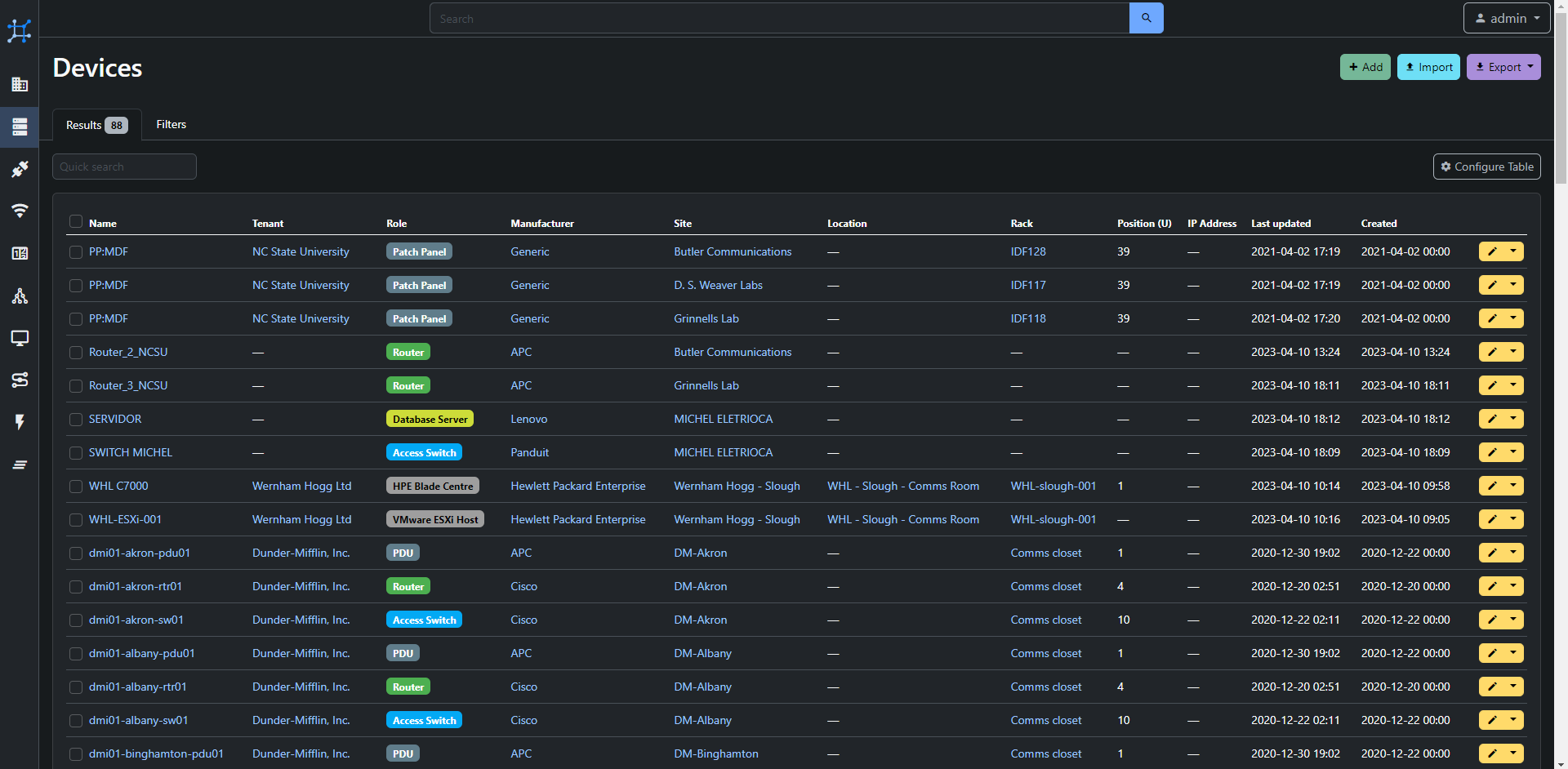
Currently there is more vertical padding in data tables than there is actual data. Taking an example from the demo site:

Whitespace below row separator line until tickbox is 14 pixels.
The tickbox at the left is vertically 16 pixels.
Whitespace below until row separator line is 14 pixels.
Taking into account the actual row separator lines it means roughly 35% of vertical space in the table is actual data and the rest is just padding!
Data is one of the main points of NetBox. So it should be the main point, front and center.
Reducing padding would assist in reaching that.
Of course there needs to be some amount of padding to keep the data readable. But look at spreadsheet programs - they have minimal padding and people have no trouble using them all day. In fact, people who use those programs each day require there to be minimal padding since they want to see the data (the reason for the whole exercise) and not scroll all the time just to see more padding.
The correct amount of padding surely is less than about 90% of actual data at the above and another 90% at the below?
Experiments would show what is the minimal usable amount of padding; or just start decreasing it every version and pull back when complaints start.
I would guess the real reasonable number is somewhere less than half of the current amount. For data rows:
paddinginhtml[data-netbox-color-mode=dark] .table>:not(caption)>*>*/ filesnetbox-{dark,light}.css.Make data great again!
Use case
To efficiently view data, the reason why NetBox exists.
Database changes
None.
External dependencies
None.
@jsenecal commented on GitHub (Apr 10, 2023):
Could you provide a screenshot of the intended looks of it and potential CSS values ? (Using chrome dev tools should work for this purpose)
@sleepinggenius2 commented on GitHub (Apr 10, 2023):
Just remember when making UI changes like this, that the WCAG target size requirement is 24px x 24px for AA conformance and 44px x 44px for AAA conformance for pointer inputs, with the latter also the recommendation for touch inputs. While cramming more data onto the screen may be desirable for some, accessibility still needs to be taken into account, especially on touch devices. At least in the US, many companies have WAI/WCAG requirements when evaluating software, especially those that fall under Section 508 compliance. A number of products allow for the user to select the desired density of list and data table items for this purpose and might be an alternative implementation to consider in this scenario.
@bluikko commented on GitHub (Apr 11, 2023):
I do not understand at all what @sleepinggenius2 is trying to say but it seems like this
is supposedly trying to say that any clickable control should be "24px x 24px" for "AA" level accessibility and "44px x 44px" for "AAA" level, where more As supposedly are "better"?
I think that it would not be realistic to propose changing that selection tickbox at the left of each data row that's currently about 16x16 px to 24x24 or even 44x44.
Does that have something to do with padding?
I am all for accessibility but 24x24 or 44x44 minimum control sizes are just not possible without majorly ruining the experience for everyone else.
It is surely better to let those who need "AA or AAA level accessibility" to zoom the page in (or let them use OS level settings to make everything bigger) instead of forcing everyone else (99% of users) to zoom out.
Even Windows Explorer at default 100% setting does not have "24x24 or 44x44" "pointer inputs" (whatever that may mean).
As for touch devices... I am strongly against designing for the very small minority lowest common denominator. Why should the experience be very far suboptimal for the very large majority because of some 5% or less of users using "touch"?
Also this is why responsive design exists.
@jsenecal I will have a look at what I can do to test. It's not something I'm familiar with but sounds straightforward.
@sleepinggenius2 commented on GitHub (Apr 11, 2023):
@bluikko, it sounds like you are not a frontend developer or, if you are, then your response is very concerning, as all frontend web developers should be intimately familiar with WCAG. Here is a link to some more information on target sizes: Understanding Target Size.
@bluikko commented on GitHub (Apr 11, 2023):
@sleepinggenius2 That's right - I am not a frontend developer. I do however have a long history using various software and I know very well how an efficient UI works. An efficient UI does not have two thirds of whitespace and one third of data.
I had followed with admiration your accessibility work. But it must not come at the price of efficiency for everyone else.
So I repeat what I said: it makes no sense to make an inefficient UI for the sake of less than 1% of users.
@sleepinggenius2 commented on GitHub (Apr 11, 2023):
I can completely understand that perspective, which is why I proposed adding a user preference to control the density of lists and data table rows. UX design is a complex field and the "efficiency" of an interface can take many factors into account. In addition to the biological factors, people have screens with different pixel densities, different mouse sensitivities, different lighting conditions, the list goes on and on. Imposing one person's preferences on the entire user base, especially when they don't necessarily meet established web accessibility standards, is not really fair. I have seen in the code where ARIA attributes have been included, in addition to discussions made during the last UI redesign, which indicate that accessibility is a concern of the NetBox developers. I support this feature request, but I was merely bringing attention to the fact that it is not as simple as just making willy nilly changes to the CSS.
@bluikko commented on GitHub (Apr 11, 2023):
Some example screenshots.
The starting point from demo instance:
Here the padding is decreased from 1 rem (!!) to 0.2 rem, which is a rather conservative decrease (it could be decreased even further but I wanted to stay at the magical 24 px even though I've not seen any policy regarding NetBox and accessibility):
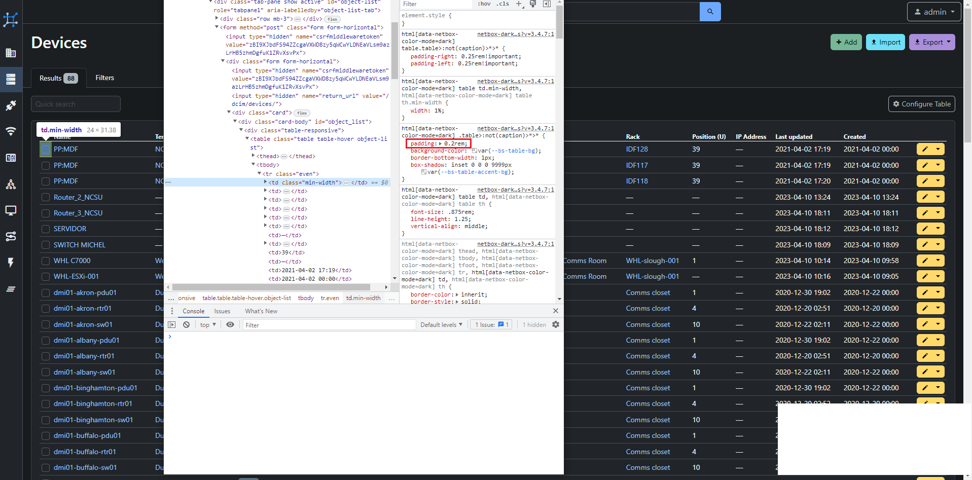
The "target size" seems to still be above the "AA" level at 24x31.38.
The amount of data lines on the first page increases from 17 to 21, that's a massive gain of almost a fourth and full data pages gain proportionally even more. And all by this simple change that takes NetBox more towards how it used to be with data being the main point.
Note how now the padding at left/right is so pronounced. This is all just wasted space but reducing it is not so simple in order to keep the controls neat:
Here I decreased the padding around the table which is simple and gains good results. But there is still 1-2 levels of padding at the sides - chiefly the are highlighted by the blue line at the left.
But this padding at the left/right side should not be decreased willy-nilly, since the padding highlighted with the green boxes should probably be taken into account/kept as is.
I would definitely look at reducing at least some of that padding highlighted with the blue line.
A separate proposal, if it is too much for this issue, should probably look at decreasing padding at left/right of the data tables to.. dare I say it: zero.
@bluikko commented on GitHub (Apr 11, 2023):
And here is a tighter example with 3 different padding changed:
Another 3 lines are gained in the first page and horizontal padding gain is more than the yellow control at the right.
Please note that we are still staying at the 24px magical double-A limit!
But the header row doesn't look good, it would need some additional padding.
Also the left/right padding of "quick search" and "Configure Table" controls are too tight IMO (the green boxes in the previous post screenshot....) - while vertical padding for these controls should be decreased.
I do digress - this example goes beyond the issue of "row vertical spacing" but I wanted to have a more complete example as well.
Edited to add: in closing I want to stress again that trying to force a touch-centric paradigm on pointer/mouse users is a big mistake and I am surprised I even need to debate this. Even Microsoft couldn't make it work, Win8 was universally panned and disliked.
This is why responsive design exists.
Also I do not remember seeing even 1 issue requesting more padding or whitespace. On the contrary, there are plenty of issues about moving back to an efficient UI.
@kkthxbye-code commented on GitHub (Apr 11, 2023):
Please link them for context, it helps gauge actual interest. I only remember one though, which is this one:
https://github.com/netbox-community/netbox/issues/7497
Also, please try to avoid hyperbole and speaking like an expert if you are not one. UI design is hard and I'm certain that there's room for improvement, however changes must be carefully thought out. In the end you have argued your personal preference, which is fine, but try to realize that not everyone will share it.
My personal opinion is that trying to make netbox look like a spreadsheet, as seem to be your goal, is not a great way to design modern websites. Your last example here would look absolutely terrible on any monitor with a larger resolution imo.
I do think that providing a compact list preference could be a fine idea.
@bluikko commented on GitHub (Apr 11, 2023):
In addition to that 11682, 6975, 6372 come up with keyword "padding" and they seem to be relevant to general "whitespace"/"padding".
I note that some of those are even pre-3.0 and if I remember correctly the amount of whitespace has really blown up at/after 3.0.
2.x was much more conservative with whitespace and I do not recall anyone requesting for more padding or complaining. I could not find any such issues either.
Nowhere do I argue for zero padding between rows. Initially I had proposed halving from the current 1rem but looking at the results (in the above screenshots) I feel that the 0.2rem may be closer to the sweet spot on my current 1080p screen.
I am currently not with my high-dpi screen and unfortunately may not be with it in some weeks so I could not answer to this right now. Maybe you have an example then?
However - I suspect that those users who want to have larger UI elements would have configured their OS-level controls according to their screen and personal preferences.
I totally agree that this scenario is absolutely something that needs to be considered!
I also want to return to your statement about "not a great way to design modern websites". Would you care to expand this with something constructive?
In my OP I had stated my rationale and I try to rephrase it here: the main point of NetBox is to show data tables. The reason it exists is for data which may be sometimes be viewed by users through the web interface. Shouldn't that data then be the basis of the design and not "making it look shiny" or "fruity" or "trendy"?
Some whitespace is definitely a requirement due to our neurophysiology. But what argument is there for having two thirds of vertical screen real estate as padding? One of the features that help here, shading alternating rows with slightly different background colors has seemingly been dropped at some point - I think it used to be done before (together with much less vertical padding).
There is currently a trend towards excessive whitespace everywhere and this can be seen even in Windows 11. Whitespace may be a usability requirement for touch UI but as I had argued above I suspect that these users are in an overwhelming minority and as such could be satisfied with a responsive design instead of making a suboptimal experience for traditional pointer users.
@kkthxbye-code commented on GitHub (Apr 11, 2023):
11682 is about a very specific inline padding for search highlighting, nothing to do with your FR. 6975 is regarding footer padding, not list padding, and it was fixed. 6372 is regarding pre-3.0 ui. You are clearly misrepresenting the amount of complaints that have been about table row padding.
Not sure where this came from. Spreadsheets do not have zero padding afaik.
Playing devils advocate, could the same advise not just be given to you?
As none of us are frontenders or UX designers, it would not be constructive, which was kinda my point. My subjective opinion is that almost zero padding lists look terrible, control terribly and provide little benefit for me personally. You have the oposite opinion, but you present some of your arguments as facts, like the efficiancy of less padding (see. your use case).
I don't think that is a given.
Now you are just making stuff up. We are pretty much using the default table from bootstrap, just because you dislike something doesn't mean it's wrong.
Again, I think a compact mode would be fine. I also think the extremely small values for padding that you have shown are too much, even for a compact mode. The only other issue was even accepted as needs owner, but no one made a concrete suggestion for changes.
Edit:
For reference, here's the difference in padding between v3.4.x and v2.11.12 - while ever so slightly more, it doesn't seem to match your memory of the situation:
@bluikko commented on GitHub (Apr 11, 2023):
Are you intentionally reading what I wrote wrong? I specifically said
seem to be relevant to general "whitespace"/"padding"!Whitespace will be increased the same way as actual data, the proportions stay the same. Whitespace proportion will not be decreased this way. While your original statement was very non-specific and lacking of constructive substance, in line with most of what's written here, I assume you originally argued that there is too much in the screen on high-dpi screens and this will be rectified by using OS level zoom.
The rest seems to continue in the same non-constructive manner so I will just address this point:
It used to not be like this, so something has been changed. Compare to screenshot in your own link issue 7497. The padding has increased considerably:
vs
You are clearly misrepresenting the amount of whitespace that used to be used earlier in your screenshots.
@kkthxbye-code commented on GitHub (Apr 11, 2023):
There seems to be a communication barrier here that I'm not sure we'll be able to surmount and to be frank you have a very combative way of arguing that seems less than constructive.
I'll refrain from handling this, but please update your FR to contain the specific changes you are suggesting. If it needs more discussion before you can propose the actual change, feel free to create a discussion instead.
@bluikko commented on GitHub (Apr 11, 2023):
I have done that and summarized some of the concerns listed in the replies.
Must indeed be some barrier since this phrase exactly fits how it seemed to me!
@jeremystretch commented on GitHub (Apr 11, 2023):
A few thoughts:
table-sm(small) class that reduces cell padding by 50%, which I believe is the ultimate goal of this FR. I've included screenshots below showing the original and reduced padding.There are two options moving forward:
Please limit discussion to the merits of either of these two options.
@bluikko commented on GitHub (Apr 11, 2023):
We must see it differently then - the OP was not supposed to be confrontational and I have to say I fail to see it. I use conditionals and questions when I do not present facts, even humor at the last line.
Things like percentages that I state as facts are based on my calculations. I am at a loss at how to make it more neutral. But also I do not want to distract from the main subject more by this discussion. Must be something wrong in my language.
I suggest that:
+1 on https://github.com/netbox-community/netbox/issues/12199#issuecomment-1503242751 for screenshot 2 which seems to achieve what the OP proposes; -1 for the first screenshot (do nothing).
What's still missing is a highdpi screenshot, unfortunately I can't do a test myself until some weeks.
@sleepinggenius2 commented on GitHub (Apr 11, 2023):
Would you be open to making this a setting under User Preferences?
Here are the same screenshots from the mobile interface for reference as well.
@jeremystretch commented on GitHub (Apr 11, 2023):
No; whatever we decide will need to be the single style built into the application. Maybe the eventual UI overhaul I mentioned will provide some mechanism for customization in this manner, but we can't reasonably introduce new customizations at this point.
@jsenecal commented on GitHub (Apr 14, 2023):
I would also like to remind everyone interested that user-space utilities like Greasemonkey/Tampermonkey exist for those situations where the UI doesn't look the way an individual requires it.
@github-actions[bot] commented on GitHub (Jul 14, 2023):
This issue has been automatically marked as stale because it has not had recent activity. It will be closed if no further activity occurs. NetBox is governed by a small group of core maintainers which means not all opened issues may receive direct feedback. Do not attempt to circumvent this process by "bumping" the issue; doing so will result in its immediate closure and you may be barred from participating in any future discussions. Please see our contributing guide.
@github-actions[bot] commented on GitHub (Aug 14, 2023):
This issue has been automatically closed due to lack of activity. In an effort to reduce noise, please do not comment any further. Note that the core maintainers may elect to reopen this issue at a later date if deemed necessary.