mirror of
https://github.com/netbox-community/netbox.git
synced 2026-01-11 21:10:29 +01:00
Improve efficiency of UI layout #5492
Closed
opened 2025-12-29 19:28:39 +01:00 by adam
·
5 comments
No Branch/Tag Specified
main
update-changelog-comments-docs
feature-removal-issue-type
20911-dropdown
20239-plugin-menu-classes-mutable-state
21097-graphql-id-lookups
feature
fix_module_substitution
20923-dcim-templates
20044-elevation-stuck-lightmode
feature-ip-prefix-link
v4.5-beta1-release
20068-import-moduletype-attrs
20766-fix-german-translation-code-literals
20378-del-script
7604-filter-modifiers-v3
circuit-swap
12318-case-insensitive-uniqueness
20637-improve-device-q-filter
20660-script-load
19724-graphql
20614-update-ruff
14884-script
02496-max-page
19720-macaddress-interface-generic-relation
19408-circuit-terminations-export-templates
20203-openapi-check
fix-19669-api-image-download
7604-filter-modifiers
19275-fixes-interface-bulk-edit
fix-17794-get_field_value_return_list
11507-show-aggregate-and-rir-on-api
9583-add_column_specific_search_field_to_tables
v4.5.0
v4.4.10
v4.4.9
v4.5.0-beta1
v4.4.8
v4.4.7
v4.4.6
v4.4.5
v4.4.4
v4.4.3
v4.4.2
v4.4.1
v4.4.0
v4.3.7
v4.4.0-beta1
v4.3.6
v4.3.5
v4.3.4
v4.3.3
v4.3.2
v4.3.1
v4.3.0
v4.2.9
v4.3.0-beta2
v4.2.8
v4.3.0-beta1
v4.2.7
v4.2.6
v4.2.5
v4.2.4
v4.2.3
v4.2.2
v4.2.1
v4.2.0
v4.1.11
v4.1.10
v4.1.9
v4.1.8
v4.2-beta1
v4.1.7
v4.1.6
v4.1.5
v4.1.4
v4.1.3
v4.1.2
v4.1.1
v4.1.0
v4.0.11
v4.0.10
v4.0.9
v4.1-beta1
v4.0.8
v4.0.7
v4.0.6
v4.0.5
v4.0.3
v4.0.2
v4.0.1
v4.0.0
v3.7.8
v3.7.7
v4.0-beta2
v3.7.6
v3.7.5
v4.0-beta1
v3.7.4
v3.7.3
v3.7.2
v3.7.1
v3.7.0
v3.6.9
v3.6.8
v3.6.7
v3.7-beta1
v3.6.6
v3.6.5
v3.6.4
v3.6.3
v3.6.2
v3.6.1
v3.6.0
v3.5.9
v3.6-beta2
v3.5.8
v3.6-beta1
v3.5.7
v3.5.6
v3.5.5
v3.5.4
v3.5.3
v3.5.2
v3.5.1
v3.5.0
v3.4.10
v3.4.9
v3.5-beta2
v3.4.8
v3.5-beta1
v3.4.7
v3.4.6
v3.4.5
v3.4.4
v3.4.3
v3.4.2
v3.4.1
v3.4.0
v3.3.10
v3.3.9
v3.4-beta1
v3.3.8
v3.3.7
v3.3.6
v3.3.5
v3.3.4
v3.3.3
v3.3.2
v3.3.1
v3.3.0
v3.2.9
v3.2.8
v3.3-beta2
v3.2.7
v3.3-beta1
v3.2.6
v3.2.5
v3.2.4
v3.2.3
v3.2.2
v3.2.1
v3.2.0
v3.1.11
v3.1.10
v3.2-beta2
v3.1.9
v3.2-beta1
v3.1.8
v3.1.7
v3.1.6
v3.1.5
v3.1.4
v3.1.3
v3.1.2
v3.1.1
v3.1.0
v3.0.12
v3.0.11
v3.0.10
v3.1-beta1
v3.0.9
v3.0.8
v3.0.7
v3.0.6
v3.0.5
v3.0.4
v3.0.3
v3.0.2
v3.0.1
v3.0.0
v2.11.12
v3.0-beta2
v2.11.11
v2.11.10
v3.0-beta1
v2.11.9
v2.11.8
v2.11.7
v2.11.6
v2.11.5
v2.11.4
v2.11.3
v2.11.2
v2.11.1
v2.11.0
v2.10.10
v2.10.9
v2.11-beta1
v2.10.8
v2.10.7
v2.10.6
v2.10.5
v2.10.4
v2.10.3
v2.10.2
v2.10.1
v2.10.0
v2.9.11
v2.10-beta2
v2.9.10
v2.10-beta1
v2.9.9
v2.9.8
v2.9.7
v2.9.6
v2.9.5
v2.9.4
v2.9.3
v2.9.2
v2.9.1
v2.9.0
v2.9-beta2
v2.8.9
v2.9-beta1
v2.8.8
v2.8.7
v2.8.6
v2.8.5
v2.8.4
v2.8.3
v2.8.2
v2.8.1
v2.8.0
v2.7.12
v2.7.11
v2.7.10
v2.7.9
v2.7.8
v2.7.7
v2.7.6
v2.7.5
v2.7.4
v2.7.3
v2.7.2
v2.7.1
v2.7.0
v2.6.12
v2.6.11
v2.6.10
v2.6.9
v2.7-beta1
Solcon-2020-01-06
v2.6.8
v2.6.7
v2.6.6
v2.6.5
v2.6.4
v2.6.3
v2.6.2
v2.6.1
v2.6.0
v2.5.13
v2.5.12
v2.6-beta1
v2.5.11
v2.5.10
v2.5.9
v2.5.8
v2.5.7
v2.5.6
v2.5.5
v2.5.4
v2.5.3
v2.5.2
v2.5.1
v2.5.0
v2.4.9
v2.5-beta2
v2.4.8
v2.5-beta1
v2.4.7
v2.4.6
v2.4.5
v2.4.4
v2.4.3
v2.4.2
v2.4.1
v2.4.0
v2.3.7
v2.4-beta1
v2.3.6
v2.3.5
v2.3.4
v2.3.3
v2.3.2
v2.3.1
v2.3.0
v2.2.10
v2.3-beta2
v2.2.9
v2.3-beta1
v2.2.8
v2.2.7
v2.2.6
v2.2.5
v2.2.4
v2.2.3
v2.2.2
v2.2.1
v2.2.0
v2.1.6
v2.2-beta2
v2.1.5
v2.2-beta1
v2.1.4
v2.1.3
v2.1.2
v2.1.1
v2.1.0
v2.0.10
v2.1-beta1
v2.0.9
v2.0.8
v2.0.7
v2.0.6
v2.0.5
v2.0.4
v2.0.3
v2.0.2
v2.0.1
v2.0.0
v2.0-beta3
v1.9.6
v1.9.5
v2.0-beta2
v1.9.4-r1
v1.9.3
v2.0-beta1
v1.9.2
v1.9.1
v1.9.0-r1
v1.8.4
v1.8.3
v1.8.2
v1.8.1
v1.8.0
v1.7.3
v1.7.2-r1
v1.7.1
v1.7.0
v1.6.3
v1.6.2-r1
v1.6.1-r1
1.6.1
v1.6.0
v1.5.2
v1.5.1
v1.5.0
v1.4.2
v1.4.1
v1.4.0
v1.3.2
v1.3.1
v1.3.0
v1.2.2
v1.2.1
v1.2.0
v1.1.0
v1.0.7-r1
v1.0.7
v1.0.6
v1.0.5
v1.0.4
v1.0.3-r1
v1.0.3
1.0.0
Labels
Clear labels
beta
breaking change
complexity: high
complexity: low
complexity: medium
needs milestone
netbox
pending closure
plugin candidate
pull-request
severity: high
severity: low
severity: medium
status: accepted
status: backlog
status: blocked
status: duplicate
status: needs owner
status: needs triage
status: revisions needed
status: under review
topic: GraphQL
topic: Internationalization
topic: OpenAPI
topic: UI/UX
topic: cabling
topic: event rules
topic: htmx navigation
topic: industrialization
topic: migrations
topic: plugins
topic: scripts
topic: templating
topic: testing
type: bug
type: deprecation
type: documentation
type: feature
type: housekeeping
type: translation
Mirrored from GitHub Pull Request
Milestone
No items
No Milestone
Projects
Clear projects
No project
Notifications
Due Date
No due date set.
Dependencies
No dependencies set.
Reference: starred/netbox#5492
Reference in New Issue
Block a user
Blocking a user prevents them from interacting with repositories, such as opening or commenting on pull requests or issues. Learn more about blocking a user.
Delete Branch "%!s()"
Deleting a branch is permanent. Although the deleted branch may continue to exist for a short time before it actually gets removed, it CANNOT be undone in most cases. Continue?
Originally created by @dreng on GitHub (Oct 8, 2021).
NetBox version
v3.0.6
Feature type
Change to existing functionality
Proposed functionality
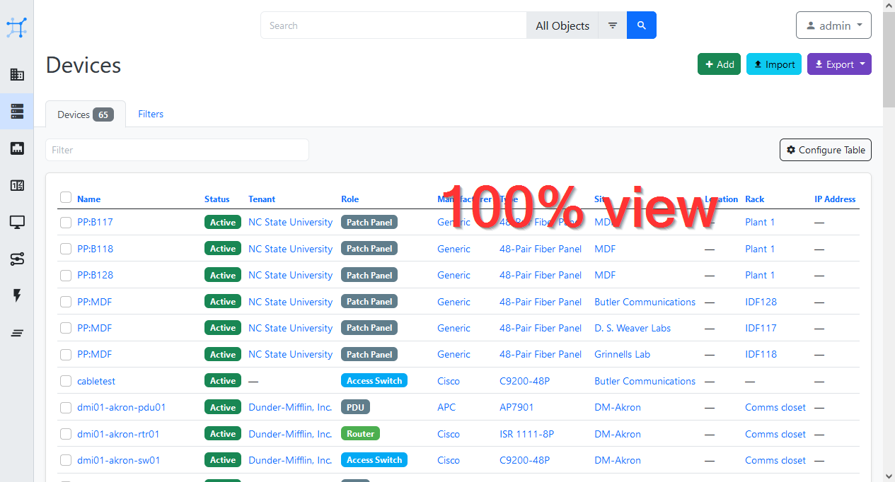
The new UI offers a modern look but wastes a lot of space. This leads to a view where information seems to become less important than buttons and search fields. I'd like to ask if it is possible to consolidate some parts in order to get back space for interesting data.
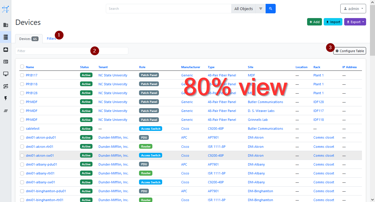
Furthermore the font is (and has always been) quite big. I reduce the browser view to 80% since I use netbox in order to see more information. Reducing the font size is not absolutely necessary since it is always possible to reduce the browser view. Nevertheless I integrated the reduction into the following mockup.
This is what I propose:
Original new UI
Original new UI reduced to 80%
Consolidated new UI reduced to 80%
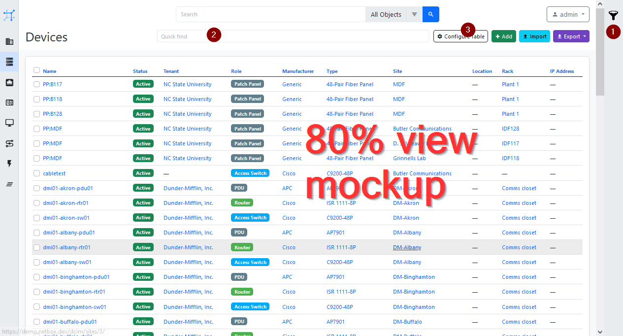
Please notice that you can see only 10 lines of data in the original view but 17 with the proposed change.
Use case
The proposed change leaves more space for the information you're interested in.
Database changes
No response
External dependencies
No response
@teixemf commented on GitHub (Oct 12, 2021):
I would like to mention #6925 could also help to recall some UI space.
@bluikko commented on GitHub (Oct 22, 2021):
After long testing I've migrated to v3. And I have to applaud the NetBox team that they have managed to save space in the horizontal direction for the main tables. Even with the menu now vertical, it is astonishing!
But it can always be improved - especially in the vertical direction as some of the suggestions in the OP.
I for one would definitely not want to have the "filter" or whatever it is (item labeled as "1" in the OP last screenshot) take horizontal space away from the tables!
When viewing data tables there should be no UI elements on the side of the data table - they should be at top/bottom.
Horizontal screen real estate is the most precious commodity and it should not be wasted to UI elements wherever possible, it should be saved for data such as the tables. IMHO only when editing something UI elements could be at left/right since most of the horizontal space is padding anyways.
While testing v3 I also initially played around with scaling the whole NetBox site to something less than 100%. I wonder if it would be possible to have a configurable setting for the "base size" of the NetBox UI - something that currently is done with browser zoom functionality? That would put to bed the question of what is the right font size/scaling.
And in general when viewing data tables of course there should be only the absolute minimum padding & margin in my opinion.
@jeremystretch commented on GitHub (Nov 12, 2021):
Tagging this as
needs ownerfor anyone who would like to propose specific improvements.@github-actions[bot] commented on GitHub (Jan 12, 2022):
This issue has been automatically marked as stale because it has not had recent activity. It will be closed if no further activity occurs. NetBox is governed by a small group of core maintainers which means not all opened issues may receive direct feedback. Please see our contributing guide.
@github-actions[bot] commented on GitHub (Feb 11, 2022):
This issue has been automatically closed due to lack of activity. In an effort to reduce noise, please do not comment any further. Note that the core maintainers may elect to reopen this issue at a later date if deemed necessary.