mirror of
https://github.com/netbox-community/netbox.git
synced 2026-03-13 05:45:48 +01:00
No Branch/Tag Specified
main
19034-rackreservation-unit-count
19953-configtemplate-debug-rendering-mode
15513-add-bulk-create-for-prefixes
21556-fix-dropdown-clearing
20152-support-for-marking-module-bays-and-device-bays-as-disabled
feature
21157-export-template-public-models
fix-claude-action
20698-add-a-read-only-vlan-ids-count-to-the-vlanrange-model
21114-data-source
21579-script-add-button-permissions
19867-preserve-per_page-param
21357-register-model-actions
21025-pre-render-config-contexts
21518-cf-decimal-zero
21364-swagger
20442-callable-audit
feature-ip-prefix-link
20911-dropdown-3
fix_module_substitution
21203-q-attr-denorm
21160-filterset
21118-site
20911-dropdown-2
21102-fix-graphiql-explorer
20044-elevation-stuck-lightmode
v4.5-beta1-release
20068-import-moduletype-attrs
20766-fix-german-translation-code-literals
20378-del-script
7604-filter-modifiers-v3
circuit-swap
12318-case-insensitive-uniqueness
20637-improve-device-q-filter
20660-script-load
19724-graphql
20614-update-ruff
14884-script
02496-max-page
19720-macaddress-interface-generic-relation
19408-circuit-terminations-export-templates
20203-openapi-check
fix-19669-api-image-download
7604-filter-modifiers
19275-fixes-interface-bulk-edit
fix-17794-get_field_value_return_list
11507-show-aggregate-and-rir-on-api
9583-add_column_specific_search_field_to_tables
v4.5.4
v4.5.3
v4.5.2
v4.5.1
v4.5.0
v4.4.10
v4.4.9
v4.5.0-beta1
v4.4.8
v4.4.7
v4.4.6
v4.4.5
v4.4.4
v4.4.3
v4.4.2
v4.4.1
v4.4.0
v4.3.7
v4.4.0-beta1
v4.3.6
v4.3.5
v4.3.4
v4.3.3
v4.3.2
v4.3.1
v4.3.0
v4.2.9
v4.3.0-beta2
v4.2.8
v4.3.0-beta1
v4.2.7
v4.2.6
v4.2.5
v4.2.4
v4.2.3
v4.2.2
v4.2.1
v4.2.0
v4.1.11
v4.1.10
v4.1.9
v4.1.8
v4.2-beta1
v4.1.7
v4.1.6
v4.1.5
v4.1.4
v4.1.3
v4.1.2
v4.1.1
v4.1.0
v4.0.11
v4.0.10
v4.0.9
v4.1-beta1
v4.0.8
v4.0.7
v4.0.6
v4.0.5
v4.0.3
v4.0.2
v4.0.1
v4.0.0
v3.7.8
v3.7.7
v4.0-beta2
v3.7.6
v3.7.5
v4.0-beta1
v3.7.4
v3.7.3
v3.7.2
v3.7.1
v3.7.0
v3.6.9
v3.6.8
v3.6.7
v3.7-beta1
v3.6.6
v3.6.5
v3.6.4
v3.6.3
v3.6.2
v3.6.1
v3.6.0
v3.5.9
v3.6-beta2
v3.5.8
v3.6-beta1
v3.5.7
v3.5.6
v3.5.5
v3.5.4
v3.5.3
v3.5.2
v3.5.1
v3.5.0
v3.4.10
v3.4.9
v3.5-beta2
v3.4.8
v3.5-beta1
v3.4.7
v3.4.6
v3.4.5
v3.4.4
v3.4.3
v3.4.2
v3.4.1
v3.4.0
v3.3.10
v3.3.9
v3.4-beta1
v3.3.8
v3.3.7
v3.3.6
v3.3.5
v3.3.4
v3.3.3
v3.3.2
v3.3.1
v3.3.0
v3.2.9
v3.2.8
v3.3-beta2
v3.2.7
v3.3-beta1
v3.2.6
v3.2.5
v3.2.4
v3.2.3
v3.2.2
v3.2.1
v3.2.0
v3.1.11
v3.1.10
v3.2-beta2
v3.1.9
v3.2-beta1
v3.1.8
v3.1.7
v3.1.6
v3.1.5
v3.1.4
v3.1.3
v3.1.2
v3.1.1
v3.1.0
v3.0.12
v3.0.11
v3.0.10
v3.1-beta1
v3.0.9
v3.0.8
v3.0.7
v3.0.6
v3.0.5
v3.0.4
v3.0.3
v3.0.2
v3.0.1
v3.0.0
v2.11.12
v3.0-beta2
v2.11.11
v2.11.10
v3.0-beta1
v2.11.9
v2.11.8
v2.11.7
v2.11.6
v2.11.5
v2.11.4
v2.11.3
v2.11.2
v2.11.1
v2.11.0
v2.10.10
v2.10.9
v2.11-beta1
v2.10.8
v2.10.7
v2.10.6
v2.10.5
v2.10.4
v2.10.3
v2.10.2
v2.10.1
v2.10.0
v2.9.11
v2.10-beta2
v2.9.10
v2.10-beta1
v2.9.9
v2.9.8
v2.9.7
v2.9.6
v2.9.5
v2.9.4
v2.9.3
v2.9.2
v2.9.1
v2.9.0
v2.9-beta2
v2.8.9
v2.9-beta1
v2.8.8
v2.8.7
v2.8.6
v2.8.5
v2.8.4
v2.8.3
v2.8.2
v2.8.1
v2.8.0
v2.7.12
v2.7.11
v2.7.10
v2.7.9
v2.7.8
v2.7.7
v2.7.6
v2.7.5
v2.7.4
v2.7.3
v2.7.2
v2.7.1
v2.7.0
v2.6.12
v2.6.11
v2.6.10
v2.6.9
v2.7-beta1
Solcon-2020-01-06
v2.6.8
v2.6.7
v2.6.6
v2.6.5
v2.6.4
v2.6.3
v2.6.2
v2.6.1
v2.6.0
v2.5.13
v2.5.12
v2.6-beta1
v2.5.11
v2.5.10
v2.5.9
v2.5.8
v2.5.7
v2.5.6
v2.5.5
v2.5.4
v2.5.3
v2.5.2
v2.5.1
v2.5.0
v2.4.9
v2.5-beta2
v2.4.8
v2.5-beta1
v2.4.7
v2.4.6
v2.4.5
v2.4.4
v2.4.3
v2.4.2
v2.4.1
v2.4.0
v2.3.7
v2.4-beta1
v2.3.6
v2.3.5
v2.3.4
v2.3.3
v2.3.2
v2.3.1
v2.3.0
v2.2.10
v2.3-beta2
v2.2.9
v2.3-beta1
v2.2.8
v2.2.7
v2.2.6
v2.2.5
v2.2.4
v2.2.3
v2.2.2
v2.2.1
v2.2.0
v2.1.6
v2.2-beta2
v2.1.5
v2.2-beta1
v2.1.4
v2.1.3
v2.1.2
v2.1.1
v2.1.0
v2.0.10
v2.1-beta1
v2.0.9
v2.0.8
v2.0.7
v2.0.6
v2.0.5
v2.0.4
v2.0.3
v2.0.2
v2.0.1
v2.0.0
v2.0-beta3
v1.9.6
v1.9.5
v2.0-beta2
v1.9.4-r1
v1.9.3
v2.0-beta1
v1.9.2
v1.9.1
v1.9.0-r1
v1.8.4
v1.8.3
v1.8.2
v1.8.1
v1.8.0
v1.7.3
v1.7.2-r1
v1.7.1
v1.7.0
v1.6.3
v1.6.2-r1
v1.6.1-r1
1.6.1
v1.6.0
v1.5.2
v1.5.1
v1.5.0
v1.4.2
v1.4.1
v1.4.0
v1.3.2
v1.3.1
v1.3.0
v1.2.2
v1.2.1
v1.2.0
v1.1.0
v1.0.7-r1
v1.0.7
v1.0.6
v1.0.5
v1.0.4
v1.0.3-r1
v1.0.3
1.0.0
Labels
Clear labels
beta
breaking change
complexity: high
complexity: low
complexity: medium
needs milestone
netbox
pending closure
plugin candidate
pull-request
severity: high
severity: low
severity: medium
status: accepted
status: backlog
status: blocked
status: duplicate
status: needs owner
status: needs triage
status: revisions needed
status: under review
topic: GraphQL
topic: Internationalization
topic: OpenAPI
topic: UI/UX
topic: cabling
topic: event rules
topic: htmx navigation
topic: industrialization
topic: migrations
topic: plugins
topic: scripts
topic: templating
topic: testing
type: bug
type: deprecation
type: documentation
type: feature
type: housekeeping
type: translation
Mirrored from GitHub Pull Request
Milestone
No items
No Milestone
Projects
Clear projects
No project
Notifications
Due Date
No due date set.
Dependencies
No dependencies set.
Reference: starred/netbox#5090
Reference in New Issue
Block a user
Blocking a user prevents them from interacting with repositories, such as opening or commenting on pull requests or issues. Learn more about blocking a user.
Delete Branch "%!s()"
Deleting a branch is permanent. Although the deleted branch may continue to exist for a short time before it actually gets removed, it CANNOT be undone in most cases. Continue?
Originally created by @jeremystretch on GitHub (Jul 23, 2021).
Originally assigned to: @thatmattlove on GitHub.
Proposed Changes
This issue serves as an umbrella for small changes to the desktop UI which don't warrant their own bug reports. Please comment below with any issues you encounter within the UI and we'll add it here.
For the sake of limiting scope, let's focus on issues observed on non-mobile platforms in this thread. Please note any issues with the mobile UI under #6828. Thanks!
Justification
Clean up the user interface and achieve a greater overall user experience.
@bellwood commented on GitHub (Jul 23, 2021):
Adding media attributes to the dark/light CSS references should prevent "flashing" between modes:
@bellwood commented on GitHub (Jul 23, 2021):
Search functionality in the sidebar and content pane use the same DOM
id="id_q"andid="search-button"which renders errors in dev console<input name="q" id="id_q" type="text" aria-label="Search" placeholder="Search" class="form-control" value="" aria-describedby="search-button"><button class="btn btn-primary" type="submit" id="search-button"><i class="mdi mdi-magnify"></i></button>@michaelklose commented on GitHub (Jul 23, 2021):
Footer is missing in the navigation bar after login. Shows up again after doing Strg+F5
Looks like this is a problem with Chrome and Edge Chromium. Doesn't happen with Firefox.
@bellwood commented on GitHub (Jul 23, 2021):
I can reproduce what @michaelklose is seeing but ONLY when I am able to get the sidebar footer to overflow into the menu:
Page loads after this occurs omit the nav in the sidebar until the page is hard reloaded.
@bellwood commented on GitHub (Jul 23, 2021):
Mobile/iPAD - Chrome/Brave - Main nav "login" and all buttons on the sidebar footer nav are rendered incorrectly
@bellwood commented on GitHub (Jul 23, 2021):
Mobile/iPhone 8 Plus - Chrome/Brave
-Hamburger menu
--Missing padding/margin above search bar
--Buttons on bottom nav incorrectly rendered
--Login button buried at the bottom (usability, maybe put closer ot top?), styled incorrectly
--Hard to reproduce, but, sometimes you cannot scroll inside the hamburger menu either
-General
--Some buttons ("add", "import") text isnt aligned properly
@michaelklose commented on GitHub (Jul 23, 2021):
Nav item for Config Contexts missing. URL is working: https://beta-demo.netbox.dev/extras/config-contexts/
@jeremystretch commented on GitHub (Jul 23, 2021):
@bellwood Let's limit the scope to here to non-mobile issues for now.
@michaelklose Config contexts are listed under the "other" menu heading.
@bellwood commented on GitHub (Jul 23, 2021):
@michaelklose I see it under Other -> Other -> Config Contexts, under "Tags" BUT the scrolling is really difficult there on smaller viewports where the footer nav in the sidebar obscures it.
@michaelklose commented on GitHub (Jul 23, 2021):
Ah if I zoom out I can see it. But there is no way to scroll down.
If I zoom out and in again the scroll bar appears.
@hoalex commented on GitHub (Jul 23, 2021):
When using the global search and multiple result categories are returned, there is currently no padding between the "Refine Search" button and the next section header:
@ndom91 commented on GitHub (Jul 23, 2021):
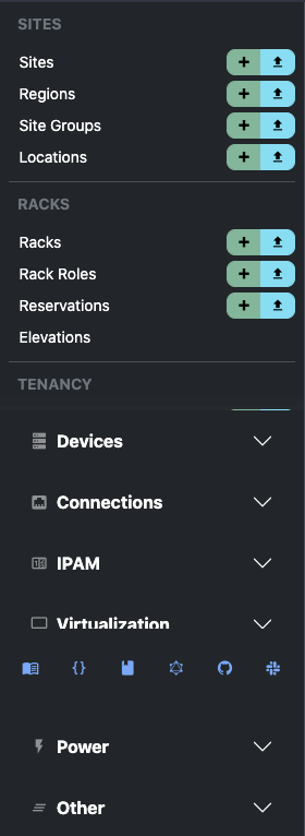
Currently large sections in the sidebar, like IPAM, create new scroll contexts inside themselves.
I think its more standard to fully open the dropdown and just scroll it with the master list of categories, i.e. extending the original scroll context.
To fix this:
EDIT: Made a small PR for it - https://github.com/netbox-community/netbox/pull/6799
@n0emis commented on GitHub (Jul 23, 2021):
The link-color in toasts is not very readable in dark mode (at least not for people with a red-green-weakness)
@n0emis commented on GitHub (Jul 23, 2021):
Also scrolling sideways is not possible on iPadOS-Devices (I tried in Safari and Firefox), which makes it impossible to e.g. access the buttons at the end of the interface list.
@bellwood commented on GitHub (Jul 23, 2021):
In reference to #issuecomment-885661042
https://github.com/twbs/bootstrap/issues/33229
Disabling
-webkit-appearance: button;in bootstraps _reboot.scss fixes the issue.Perhaps an override for this style is needed however, on BS's own docs page:
https://getbootstrap.com/docs/5.0/components/button-group/
...button groups that have
buttonon an anchor DO render correctly on mobile and MacOS Safari. So, unclear if something else is afoot.@bellwood commented on GitHub (Jul 23, 2021):
Actually, per the BS docs and that issue cited above
type="button"should not be used on anchor tags. Removing that clears the issue up without the need to touch the underlying CSS.@thatmattlove commented on GitHub (Jul 24, 2021):
Regarding the flashing issue: this is expected, and actually completely normal for websites with multiple colors modes. The issue comes from the server shipping down a default — light, in this case — and the client checking for localStorage values to override and then change the DOM to match. Workarounds always involve changing how the server rendering occurs, and NetBox is no different.
Ultimately, the workaround is to set your color mode preference in your user profile settings. When you do, that preference is saved on the server side and no DOM change is necessary once the localStorage preference is detected client-side.
@bellwood commented on GitHub (Jul 24, 2021):
The thing is, there shouldn't need to be a "work around". I cannot think of a single other website that exhibits the same flashing behaviour.
The default state of the application should detect the users' preference from
prefers-color-schemeand style as needed without placing demand on the user to perform an action they're aren't aware is required (go here, click this, save that) all the while the app is flashing (if they prefer dark mode). It will drive questions/issues/"support"From an accessibility perspective, while we all had a good laugh in the Slack about 'rapidly flashing colors' that's a very real and valid UI/UX concern.
If it's too complicated to resolve, default to light mode and only render dark mode when it is set via the profile. At least then the state of the application is known and doesn't present the user with inconsistent/unexpected behaviours.
Just my .02, meant to be constructive.
@ndom91 commented on GitHub (Jul 24, 2021):
The problem, as previously mentioned in this thread, is djangos server side vs client side rendering.
Django renders the templates into ready to go html to send to the client server side where it obviously doesn't have access to:
prefers-color-schemesettingsTherefore it sends the lightmode by default to the client. Only after the client has received the initial html, css, etc. does the js kick in, potentially read the users preferences and adjust the mode. Hence the flash.
A solution could be to store the light/dark preference on the server and render with the correct one initially. Or I believe django can also be set to client side rendering, but that would probably be a larger change..
EDIT: I see Matt's already implemented it, nevermind all that then 😅👍
@thatmattlove commented on GitHub (Jul 24, 2021):
:)
I didn't see this as that big a deal, but it seems there are some strong feelings on the topic. From my testing after
189e733, the issue is solved.@nahun commented on GitHub (Jul 26, 2021):
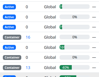
Prefixes with low utilization are hard to read the percentage. Happens in dark mode too.
@Jackbennett commented on GitHub (Jul 28, 2021):
Cable path trace is missing TYPE and LENGTH
connected build sublet in the UI is nice as a normal expected state IF you make users aware of non-normal states to be more noticeable i.e. decommissioning or planned.
@ballestr commented on GitHub (Jul 28, 2021):
I'm liking most of the new UI but I am finding very cumbersome the advanced search. The top panel takes a lot of space, and the fact that it closes back every time means more clicking around, which rapidly gets annoying when trying to refine a search. The previous arrangement with the advanced search on the side was a much better UX for power users with lots of devices.
Not sure if you want a separate ticket for this?
@Razerlikes commented on GitHub (Jul 28, 2021):
Moved to https://github.com/netbox-community/netbox/issues/6828#issuecomment-888554539
@ryanmerolle commented on GitHub (Jul 28, 2021):
There is no favicon for graphQL doc page. Not a huge item, just pointing it out vs the REST API doc pages that has a favicon.
Would be nice to use either the netbox icon or something specific to graphql so we could know what the browser tab is for by looking at the icon.
Not really important, but worth noting here.
@jeremystretch commented on GitHub (Jul 28, 2021):
@Razerlikes can you copy your comment above to #6828 please? I'd like to start tracking mobile issues separately.
@JeffTadashi commented on GitHub (Jul 29, 2021):
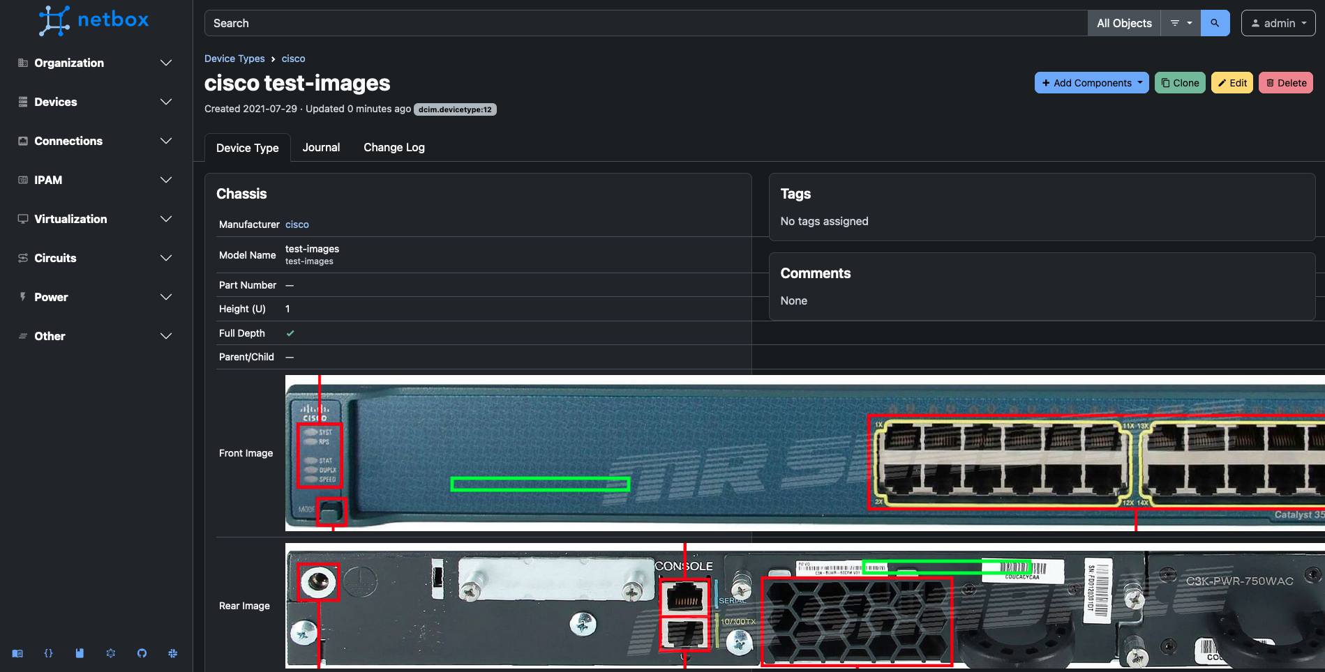
When using large front/back images for Device Types, the preview is not automatically scaled down to fit (this scale is working correctly in Netbox 2.11.6)
@Jackbennett commented on GitHub (Jul 29, 2021):
General theme emerging in the UI, not enough context if information is provided or remove excess options;
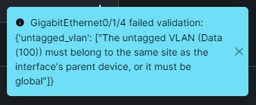
No way to tell what data vlan is in the
site: DM-Nashuawhich this device is set to.error:
edit* and making a vlan I can find, doesn't apear to work anyway. Should I make a separate issue for that?
@thatmattlove commented on GitHub (Jul 30, 2021):
This one should be fixed in
5413263.@Razerlikes commented on GitHub (Jul 30, 2021):
New sidebar: issue:
When the sidebar is pinned and you refresh the page or change pages, the whole page jumps to set the sidebar as pinned
https://user-images.githubusercontent.com/6794999/127692395-235d9eac-03c7-403c-9fad-a82ee29109e3.mp4
@tobiasge commented on GitHub (Jul 30, 2021):
Login screen is "jumping" when typing in the user or password fields. This is the feature branch on commit
9fa2acfe85, but only in Edge / Chrome. Firefox is fine.https://user-images.githubusercontent.com/1462367/127702965-f424041a-e67c-42c8-b3fa-19f6488186ed.mp4
@ndom91 commented on GitHub (Aug 1, 2021):
Just wanted to mention you can probably remove my bullet point about the nav internal scroll context as you mentioned in my PR that @thatmattlove was reworking the sidebar anyway.
If you want or need any help with that Matt, just let me know!
@thatmattlove commented on GitHub (Aug 1, 2021):
Adding a couple of tasks:
@bluikko commented on GitHub (Aug 2, 2021):
Am I the only one who finds very distracting the fade effect on text when selecting an item on a dropdown box?
When a dropdown box item is selected, the text on previously selected item fades from white to black, and text on currently selected item fades from black to white.
Edit: I mean hovering over an item in a dropdown box. Not necessarily "selecting" as in clicking on the item.
Edit2: and hovering over the currently active choice of a dropdown box renders the text invisible. The mouse pointer already changes to "forbidden", so does the text need to completely disappear? If the pointer change is not enough, how about changing the text color to grey instead of same as dropdown box background color?
Edit3: the contrast on input validation error notifications headings (dark grey vs red) is very low. (I did prefer the old notifications that were inline to the form). It would be great if at least the input field that has input validation error would be highlighted instead of just a floating box at the bottom corner. I am talking about these:
The contrast on this notification box is also very low on the IP address part (dark blue vs dark green). I am sure this depends on monitor & brightness as well but to me it looks difficult to read.
@rodvand commented on GitHub (Aug 2, 2021):
Is it a conscious choice to add the custom links to the existing buttons in a view? I can see this leading to confusion for users not knowing if the button is provided by NetBox itself, or if it's a custom link created by an admin within the org.
2.11

3.0-beta
@jeremystretch commented on GitHub (Aug 2, 2021):
Can we ensure that expanding one section within the navigation menu automatically closes any section that was already open? Otherwise the user needs to scroll around.
@ndom91 commented on GitHub (Aug 2, 2021):
@jeremystretch you mean in the sidebar nav? Some sections themselves are big enough that, even with only that one open on a 1920x1080 screen it will lead to extra scrolling. The user is going to be scrolling anyway :/
EDIT: Just checked out the latest
featureupdates - really dig the way the sidebar has evolved @thatmattlove! Full scrolling, font changes, icons to the primary footer, pinning open/closed. Nice!EDIT 2: Is it just me? Or do we have the flashing light/dark mode issue now whenever one is in "light" mode? I.e. the opposite of how it was before?
@jeremystretch commented on GitHub (Aug 2, 2021):
Yeah, I get that. Not much we can do for smaller screens. But we can at least mitigate it.
@bluikko commented on GitHub (Aug 2, 2021):
Reducing vertical whitespace for large screens could be an option.
@ndom91 commented on GitHub (Aug 2, 2021):
You mean reducing vertical whitespace for short screens? I.e. lets say < 1080px?
Theres not really a whole lot of whitespace there to take away, we could push the menu items a bit further together but idk if that would look any good.
I think a bit of scrolling is acceptable, and if we implement a bit of JS that would only allow one group to be opened at a time I think that goes a long way already.
@thatmattlove commented on GitHub (Aug 2, 2021):
@rodvand Actually yes, it was a conscious choice. Users should have a single place to go for actions, rather than having to visually hunt around for special buttons. Ultimately, it's up to the admin to visually differentiate custom links from NetBox links (if they want) by using a different color class.
Edit: I'll add that one thing we could do us use the
.btn-outline-*class for user-defined links, which may solve both problems. @jeremystretch, what do you think?@jeremystretch commented on GitHub (Aug 2, 2021):
Personally I'd rather keep custom links on a separate line below the core actions, as they are on v2.11, if only to more efficiently use the available space.
@bluikko commented on GitHub (Aug 3, 2021):
To me it looks like there is plenty of space between the items. And the NetBox logo is huge, also has plenty of margin/padding below it. I don't know.
The problem is some menus are so long that they won't fit one page (on 1080p 100% scaling). That forces the user to collapse the long menus before they can move to items below it.
To be honest I was first horrified to see 3.0 had dedicated 15% of the precious horizontal screen real estate to a damn menu (which cannot even be "minimized" to just icons instead of long text). But then I looked at the various data tables and I believe the new UI is indeed better in that sense also - the data tables seem more "tight" horizontally so the loss of 15% for the menu is not bad.
I must say that I think the new look is great.
i guess there is a reason why the menu items open inline in the left sidebar, instead of opening to right. With that design there is no choices I guess - either one scrolls or the menu would need to be tighter vertically.
I have a 1080p main screen and did testing on this one.
I tried to differentiate between computers and mobile devices with "large screens".
@jeremystretch commented on GitHub (Aug 3, 2021):
The purpose of this thread is to call out specific, reproducible bugs, not to debate the overall design. (Feel free to start a separate thread for that.) Let's please try to stay on topic so that we can focus on knocking out these bugs. Thanks!
@bluikko commented on GitHub (Aug 3, 2021):
Then perhaps the OP should be updated from "small changes".
@bellwood commented on GitHub (Aug 3, 2021):
The "All Objects"
input-group-textis has CSS border properties that other input-group do not, leading to inconsistent styling. This is most visible in light mode.@bellwood commented on GitHub (Aug 3, 2021):
Similar issue with the filter input on say
/circuits/circuits/and "Advanced Search" input group. Where "Advanced Search" is a present button, it is using theoutlinebootstrap style, however the input field itself is not, leading to inconsistent styling.@rodvand commented on GitHub (Aug 4, 2021):
That's a lot of comments... (in edit view of a Virtual Machine).
Maybe remove the one in the left column?
@bellwood commented on GitHub (Aug 4, 2021):
Data Tables are not full width when there is no Field Filters panel, see:
The Field Filters panel is broken/empty on the following pages:
@thatmattlove commented on GitHub (Aug 5, 2021):
Folks, now that all tasks on this issue are completed, I'm closing this out. Please open separate issues for any new issues you discover.
@jeremystretch commented on GitHub (Aug 5, 2021):
Thanks everyone who participated above for the detailed feedback!
@candlerb commented on GitHub (Aug 8, 2021):
Is it too late for a new comment? I've only just installed the beta :-)
I note that when you do the following:
then the sidebar block shrinks back down again as the page refreshes. This makes it a bit more painful than necessary if you just want to browse through all the options one by one.
Would it be possible to leave the panel open? It doesn't consume any real-estate, and the user can always close it manually - or when they click on some other sidebar panel, that closes the first anyway.
@Jackbennett commented on GitHub (Aug 10, 2021):
The current https://beta-demo.netbox.dev/ doesn't have that behaviour. you want your own build or wait for a newer beta release. https://github.com/netbox-community/netbox/issues/6800#issuecomment-889690749 comment is newer than the github listed beta release. I guess the beta demo app is tracking a branch head.
@jeremystretch commented on GitHub (Aug 10, 2021):
Correct, the public demo is rebuilt nightly from the
featurebranch.While we are still taking bug reports for the beta, as noted above please open a new issue for each so that they can be tracked appropriately.