mirror of
https://github.com/advplyr/audiobookshelf.git
synced 2026-09-18 07:41:28 +02:00
Enhancement: Show the time left on current audio book #63
Closed
opened 2026-04-24 22:57:29 +02:00 by adam
·
8 comments
No Branch/Tag Specified
master
auth_sessions_enhancements
account_sessions_table
logout_all_devices
pw_change_invalidates_sessions
book_tags_genres_dedupe
episode_download_fallback
Issue-4540-SortBy-StartedDate-and-FinishedDate
episode_meta_tagging
fix_authorize_race_condition
redirect_transcode_requests
progress_updated_sort
fix_ereader_socket_event
fix_change_empty_root_password
fix_podcast_session_track_index
fix_set_token
session_modal_user
localize_durations
fix_oidc_create_user
jwt_auth_refactor
fix_scanner_deleting_single_file_books
fix_mediaprogress_updatedat_2
experimental_next_client
podcast_episode_duration
episode-timestamps-clickable
book_author_secondary_sort_title
podcast_useragents
pathexists_user_access
fix_pathexists_join
book_author_secondary_sort
clean_duplicate_mediaprogress
sanitize_html_description
trix_prevent_attachments
check_path_api_fix
fix_mediaprogress_updatedat
increase_express_json_limit
fix_dockerfile_nunicode
search_episodes
audiobook_tools_update
episode_secondary_sorts
hls_stream_url_update
new_session_track_endpoint
audiobook_tools_enhancements
watcher_rescans_update
player_track_tooltip
fix_exclude_prefixes_crash
socket_item_events
fix_podcast_episode_scanner_promise
new_stats_controller
count_cache_for_userpermissions
parsing-opf-v3
validate_migration_files
fix-quick-match-all-crash
fix-chapter-end-sleep-timer
stringify_sequelize_query
remove-col-ambiguity
fix_next_prev_edit_description
details_trim_whitespace
fix_content_url_basepath
fix_logger_fatal
progress_bar_visibility
batch-edit-populate-map-details
feed_generator_updates
bookmark-modal-updates
migrate-library-item-in-scanner
migrate-new-library-items
migrate-podcasts-new-library-item-2
migrate-podcasts-new-library-item
fix-remove-episode-from-playlist
playback-session-use-new-library-item
refactor-library-item
fix-heatmap-caption
feed-episodes-upsert
share-media-player-media-session-api
remove-old-playlist
remove_old_collection_object
plugin-implementation-demo
feed_migration
refactor-feeds-from-item
fix_remove_authors_no_books
v2.17.3-fk-constraints-migration
migrations-first-upgrade
sqlite_2
feature/nuxt-target-server
waveform
sqlite
playlists
video
v2.36.1
v2.36.0
v2.35.1
v2.35.0
v2.34.0
v2.33.2
v2.33.1
v2.33.0
v2.32.1
v2.32.0
v2.31.0
v2.30.0
v2.29.0
v2.28.0
v2.27.0
v2.26.3
v2.26.2
v2.26.1
v2.26.0
v2.25.1
v2.25.0
v2.24.0
v2.23.0
v2.22.0
v2.21.0
v2.20.0
v2.19.5
v2.19.4
v2.19.3
v2.19.2
v2.19.1
v2.19.0
v2.18.1
v2.18.0
v2.17.7
v2.17.6
v2.17.5
v2.17.4
v2.17.3
v2.17.2
v2.17.1
v2.17.0
v2.16.2
v2.16.1
v2.16.0
v2.15.1
v2.15.0
v2.14.0
v2.13.4
v2.13.3
v2.13.2
v2.13.1
v2.13.0
v2.12.3
v2.12.2
v2.12.1
v2.12.0
v2.11.0
v2.10.1
v2.10.0
v2.9.0
v2.8.1
v2.8.0
v2.7.2
v2.7.1
v2.7.0
v2.6.0
v2.5.0
v2.4.4
v2.4.3
v2.4.2
v2.4.1
v2.4.0
v2.3.5
v2.3.4
v2.3.3
v2.3.2
v2.3.1
v2.3.0
v2.2.23
v2.2.22
v2.2.21
v2.2.20
v2.2.19
v2.2.18
v2.2.17
v2.2.16
v2.2.15
v2.2.14
v2.2.13
v2.2.12
v2.2.11
v2.2.10
v2.2.9
v2.2.8
v2.2.7
v2.2.6
v2.2.5
v2.2.4
v2.2.3
v2.2.2
v2.2.1
v2.2.0
v2.1.5
v2.1.4
v2.1.3
v2.1.2
v2.1.1
v2.1.0
v2.0.24
v2.0.23
v2.0.22
v2.0.21
v2.0.20
v2.0.19
v2.0.18
v2.0.17
v2.0.16
v2.0.15
v2.0.14
v2.0.13
v2.0.12
v2.0.11
v2.0.10
v2.0.9
v2.0.8
v2.0.7
v2.0.6
v2.0.5
v2.0.4
v2.0.3
v2.0.2
v2.0.1
v1.7.2
v1.7.1
v1.7.0
v1.6.0
v1.5.5
v1.5.0
v1.4.11
v1.4.9
v1.4.7
v1.4.6
v1.4.4
v1.4.2
v1.4.0
v1.4.1
v1.3.4
v1.3.3
v1.3.1
v1.2.8
v1.2.6
v1.2.5
v1.2.4
v1.2.1
v1.1.15
v1.1.14
v1.1.13
v1.1.12
v1.1.11
v1.1.10
v1.1.9
v1.1.8
v1.0.0
0.9.61-beta.0
0.9.61-beta
Labels
Clear labels
authentication
backlog
bug
chapter editor
config-issue
ebooks
encoding/embedding
enhancement
help wanted
listening sessions & progress
planned
possible plugin
progress sync
pull-request
sorting/filtering/searching
unable to reproduce
upload
users & permissions
waiting
Mirrored from GitHub Pull Request
No labels
Milestone
No items
No Milestone
Projects
Clear projects
No projects
Assignees
 adam (Adam Melkus)
Clear assignees
adam (Adam Melkus)
No Assignees
Notifications
Due Date
No due date set.
Dependencies
No dependencies set.
Reference: starred/audiobookshelf#63
Reference in New Issue
Block a user
Blocking a user prevents them from interacting with repositories, such as opening or commenting on pull requests or issues. Learn more about blocking a user.
Originally created by @juriroemer on GitHub (Oct 23, 2021).
Show the time left on the current audio book in the player. Maybe beneath the overalltime on the right or toggleable (toggle between time left and time overall by clicking, like in the Youtube app).
@advplyr commented on GitHub (Oct 23, 2021):
Can you show an example of how you would like it to look?
@juriroemer commented on GitHub (Oct 24, 2021):
My suggestion would be to make the overall running time a toggle switch that switches between overall running time and time remaining when it's clicked. Would look exactly like it does now, but would switch when clicked. Maybe even have the momentary state persistent as user preference.
The Youtube mobile apps do something similar (tab the time indicator on the lower left in the app's video player). Although I think it's more useful to always show time progressed and to switch overall time, than to always show overall time and switch time progressed (as YT does)
https://user-images.githubusercontent.com/31971585/138579570-6fa38339-3d98-4afa-9fa3-ca2833d06395.mov
Hope this is understandable
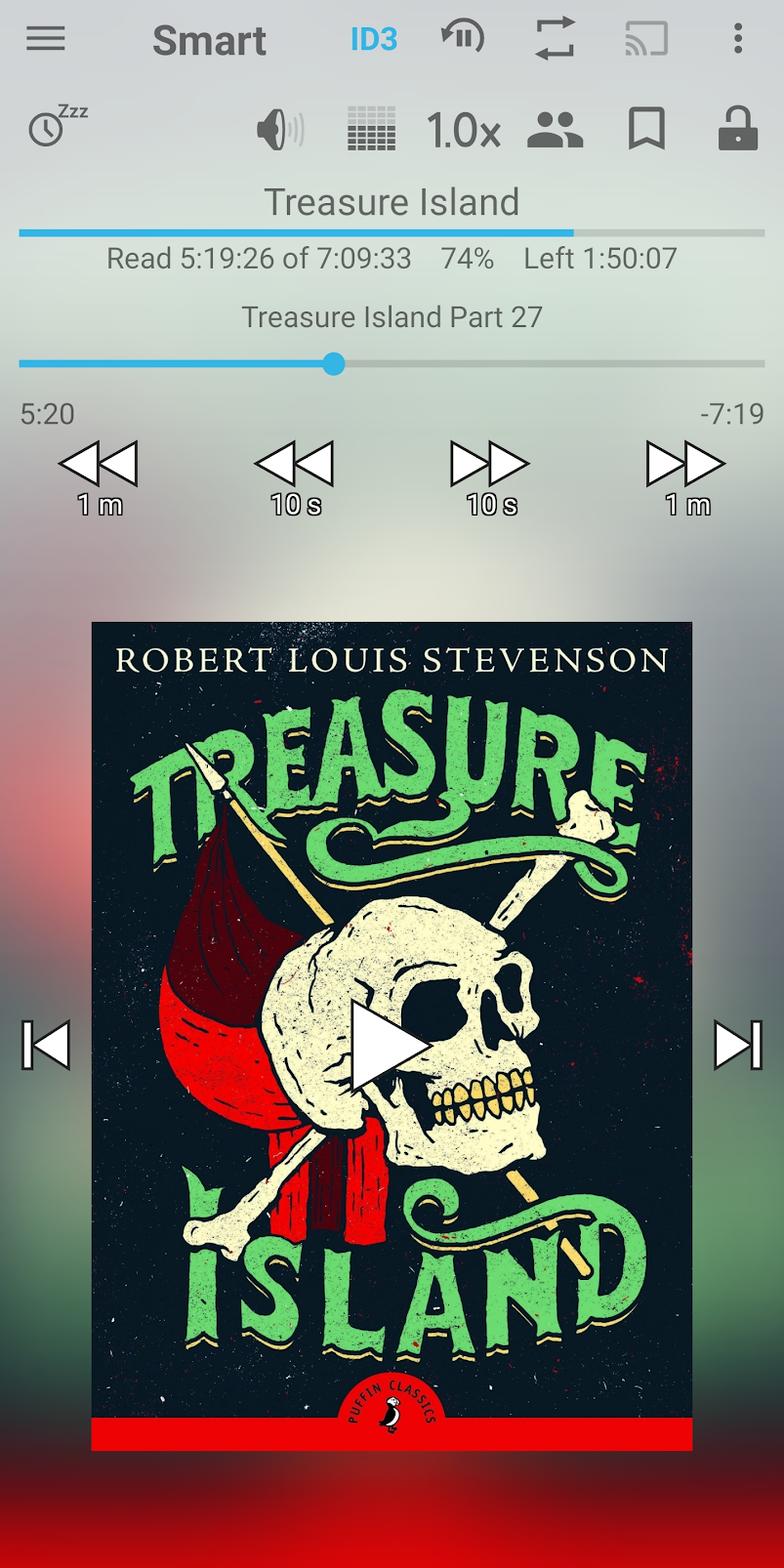
@TheSylus commented on GitHub (Oct 24, 2021):
Maybe it could be done like the smart audio player shows the tracks.
@juriroemer commented on GitHub (Oct 24, 2021):
Hm I think the text is a bit intrusive and doesn't really serve any purpose as the measures are pretty much self explanatory from context. How about something like this?
Mockup:

@advplyr commented on GitHub (Oct 25, 2021):
I liked the last one the best. Just pushed this update in
v1.5.2Let me know what you think
@juriroemer commented on GitHub (Oct 25, 2021):
Just tested
v1.5.2- very cool.I personally would leave out the "by " in front of the authors name (or at least not have it be part of the link) and I liked the color as it was before (
text-gray-400instead oftext-gray-200for the author and runtime), but looks great either way :)EDIT:
Vertical alignment is a bit tricky but I think icons could work nicely:
@advplyr commented on GitHub (Oct 27, 2021):
You were right, it looked much better. I included those updates in release v1.5.5.
I could really use your design advice everywhere else too. The experimental bookmarks feature #115 could use some design tips also!
@juriroemer commented on GitHub (Oct 27, 2021):
Sure I'll have a look :)